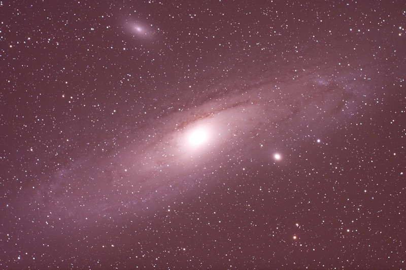
 Unprocessed RAW image of the Andromeda GalaxyI just saw something another artist posted on their Twitter that I thought was interesting. Sheep Incognito posted an early rendition of a painting the artist is working on for Christmas. I thought this would be most interesting and instructional for me to do as well with one of my most recent astrophotos. So today we begin by posting a RAW image that has simply been converted to jpg. This is "what the camera sees." We have begun some discussions on whether or not the camera is the teller of "truth," but we will not get into that discussion for now. I obviously believe the camera is a big fat liar! So we will monitor the development of this print as it evolves. As Ansel Adams once said, "you do not take a picture, but you MAKE a picture." So we will watch as the Andromeda Galaxy becomes a picture worth hanging on your wall over the next few weeks. I hope you enjoy the process and off we go....
Photographic Education
Light Room 3.0 for Astronomical Images
I recently upgraded to LR 3.0 and had an opportunity to work up an Omega Centauri Globular Cluster image. One of the upgraded features in LR 3.0 is an enhanced noise reduction tool. The new noise reduction seems to have smarter power. Meaning that is applies a stronger smoothing effect to the image while still preserving detail. Now remember some of these astronomical images contain the worst noise you can imagine. The particular screen shot here is of a 1 minute exposure at ISO 6400. I couldn't even take this photograph one year ago at those settings. So technology and software have come a long way in noise reduction. The screen is a split screen image. The image on the left is before noise reduction and the image on the right is after noise reduction has been applied.
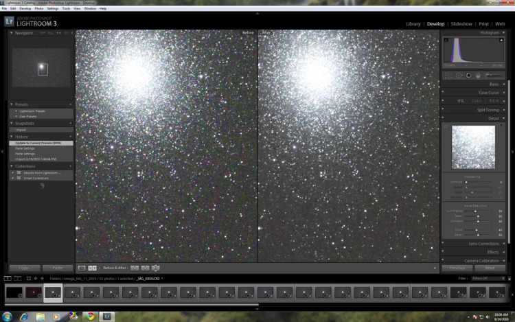
The settings I use in this screen shot are for demonstration purposes. You can clearly see the benefit is strongest in color noise reduction. While there is still some color mottling, it is reduced greatly and the high value color noise levels are reduced dramatically. The ISO 6400 images were used to capture the extension of the globular cluster and ultimately a lower ISO image was used for the stars and background sky. But it is very encouraging to see such a noise reduction capability with ISO 6400. I tend to not apply too much luminosity reduction as the image will realize a noise reduction through stacking of multiple images. But the color noise reduction is one that really helps smooth the background sky and when stacked leads to a very clean and neutral sky background.
Once again, when it comes to utilizing a DSLR for astronomical imaging things are only getting better.
To learn more about image processing please see my "Learn Digital Photography" menu item above for customized education in Light Room or Photoshop.
A Day for Fine Art Photography
Today was a perfect example of what production in Fine Art Photography entails. The image enhancement does not stop at the final digital optimization for the web. I don't simply upload an image to a mass production printer and let them print the image on whatever paper using whatever profile they wish.
Today I spent hours optimizing the "Atlantic Morning" print for an upcoming art show. I was very happy with the image on the screen and the first proof prints looked fine at 8x10 and even the 11x14. Then came the 28x16 attempt and something was definitely lacking. Normally my images expand and become even more alive in larger prints, especially on the Canson Baryta Photographique paper. This particular paper has a luster finish which is more like a glossy than a mat paper.
 Atlantic MorningBut there were some printing irregularities that were showing up as well as the color fidelity just wasn't there. I have seen these printing irregularities before on luster types of paper, in particular with images that have large smooth areas of fairly bright tones. It is mainly a function of the ink simply not going on the luster paper in a uniform fashion and there can be very subtle thick bands. Not like the original banding from the ancient inkjet days, but thick variations in luminosity that can only just barely be picked up by the eye at certain angles. This is a very rare event, but it does happen and fortunately through experience I know how to handle it. So after optimizing and evaluating the print as much as I could for the given luster paper profile, I decided to move onto my classic standby paper, Hahnemuhle Photo Rag.
Now moving to a new paper requires reviewing the original image in Photoshop and proofing it utilizing the appropriate paper profile. You may already know this, but there are multiple profiles for just one paper. There are profiles for daylight, tungsten, fluorescent, combined light, high contrast, phatte black...you get the picture. I have, over time, narrowed the profiles and papers down to the two I like the most. For me, it is vital to have at least two paper options, one luster and one photo rag, from which to select. It also goes without saying that the paper should meet all archival standards to guarantee years of enjoyment at the original color fidelity. It is important to have these options as you never really know what paper an image will really sparkle on and you get surprised sometimes like I did today.
Today was a perfect example of what a fine art photographer does. Sweats out the last detail until the image on paper looks the way he/she intended. It is amazing how good this print looks on the photo rag paper. I went from being totally discouraged to being ecstatic with a few minor adjustments to the original file and a switch to a more appropriate paper.
This is part of the value that a fine art photographer creates. I know that it can sometimes be hard to understand that value and my hope is that when you see my fine art prints that it becomes all too obvious that this is something more than just a file that was printed by a mass production print house.
Thanks so much for your support of Jeff Ball Photography and have a great day.
Kool Tac and Perma Lon-no orange peel here
Dry mounting photographic prints has been, at times, a necessary evil. I always tried to avoid a dry mount, but for large prints on glossy papers it was necessary. One of the biggest problems of dry mounting was the "orange peel" look of the surface of the print once it was dry-mounted. The term is extremely accurate in describing the look, the print surface would look like that of an orange, especially when viewed at oblique angles.
I am very fortunate to live in Huntington, WV which is home to a regional wholesale framer and distributor, Mayne Framing and Supply. The experts there recently educated me on a new mounting option free from the orange peel effect. There are actually two products involved, one is the mounting board and the other is the adhesive for the print. The dry mount board is Kool Tack and the adhesive is Perma Lon. The two together produce outstanding results.
I have now mounted both glossy and matte papers with the Kool Tac/Perma Lon combination and simply love the results. The surface of the print is really just as smooth as the surface of the actual paper. Little to no mounting/dry board texture can be seen on the prints. They are simply beautiful.
Now the photographer has a mounting option that gets out of the way of the print and lets the viewer become more engaged in the print. I highly recommend Kool Tac/Perma Lon for your photographic mounting needs.
Here are two links for you.
And if you are looking for a distributor, I highly recommend Mayne Framing.
Surprises from printing marathon...
Preparing for the Norton Commons show next month and fine tuning all of the astronomical fine art prints. I have said it too many times, but an image that looks fine on the monitor is often times not nearly ready for fine art printing. Over the past few days I have been optimizing my astrophotography prints and today I had an opportunity to compare two different papers.
Now earlier in the week I had an opportunity to compare my two favorite papers, Hahnemuhle Photo Rag (matte paper) to Harman Fiber Gloss (semi-glossy.) To my surprise I preferred the matte paper to the glossy. Today I just received a new semi-glossy paper, Canson Baryta. Just finished the new comparison and again, I prefer the matte paper for my current asto prints. The Canson looks like a gorgeous paper and will probably become my preferred paper for landscape prints. But for astrophotography prints right now, the matte paper provides a more comfortable look into the scene and presents the image in the best possible way.
My first thought at the beginning of the week was that the semi-glossy paper would be the preferred for the astronomical subjects. But the darks in the matte paper and the subdued contrast and highlights really deepen the visual experience of each astronomical print.
So after numerous hours of printing and comparing I am very confident in printing my next round of astronomical prints with the Hahnemuhle Photo Rag matte paper. It really looks wonderful!